

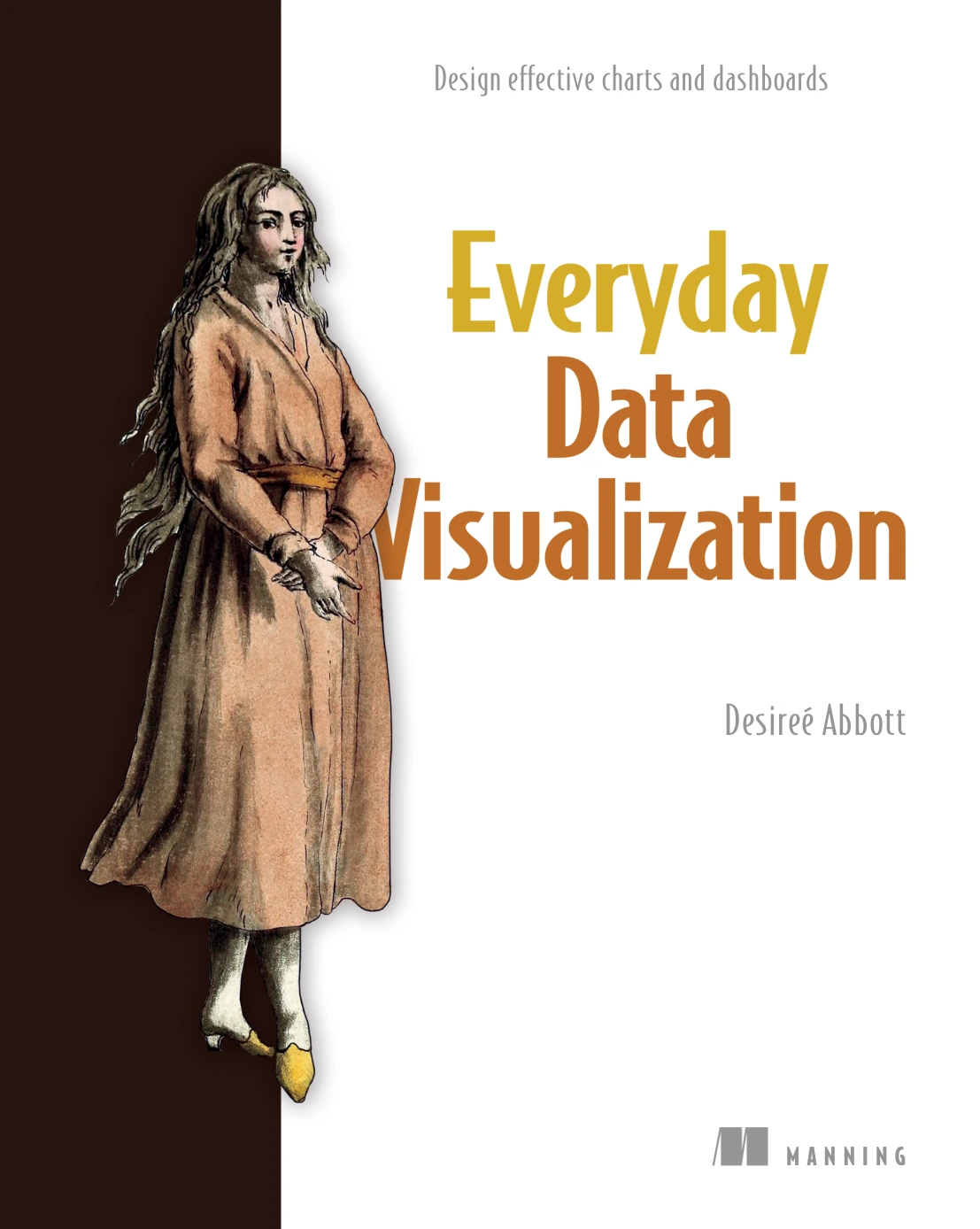
Everyday Data Visualization: Design Effective Charts and Dashboards
Original price was: $27.49.$13.74Current price is: $13.74.

Desireé Abbott
Product Specs:
- File Type: PDF
- File Size: 16.5 MB
- Book Language: English
- Total Page Count: 266
- Instant Download
Good data visualization is more than putting numbers into a chart. It means understanding the data, choosing visual forms people can read, and making design decisions that guide attention without getting in the way. In Everyday Data Visualization, Desireé Abbott brings those decisions together in a practical, tool-agnostic guide to designing charts and dashboards.
The book moves from the way people perceive visual information to the data and design choices behind effective graphics. Its focus is useful for readers who already work with data tools and want to make their charts, reports, and dashboards clearer and more considered.
Start with how people see
Abbott introduces preattentive attributes such as color, form, position, and movement, then explores Gestalt principles including proximity, similarity, and continuity. These ideas help explain why some visual arrangements are easy to understand at a glance while others leave the reader working harder than necessary.
Make the data part of the design process
Before choosing a chart, readers look at where data comes from, how measures and dimensions differ, and how values and structures can be described. This grounding connects the design of a visualization to the information it needs to communicate—not just to its appearance.
Use color and type with purpose
The chapters on color cover color models, color spaces, and ways to build continuous and categorical palettes. Abbott also addresses inclusive palette choices, color vision deficiency, accessibility guidance, and cultural considerations. Typography receives its own chapter, giving readers another essential tool for making visual information easier to navigate.
From charts to interactive dashboards
The book proceeds to chart creation and interactive visualization, then follows the broader work of research, design, and development. A final troubleshooting chapter rounds out the sequence, keeping attention on the practical choices involved in bringing a visualization from an initial idea toward publication.
For people who work with data
Written for readers experienced with data analysis tools, this guide is relevant to analysts, designers, and others creating charts, reports, or dashboards. Its software-independent principles make the emphasis less about learning a particular interface and more about making informed visual decisions wherever the work happens.
If you want to think more carefully about how data, perception, and design work together, Abbott’s book offers a structured place to begin.
User Reviews
Be the first to review “Everyday Data Visualization: Design Effective Charts and Dashboards”
You must be logged in to post a review.
Original price was: $27.49.$13.74Current price is: $13.74.






There are no reviews yet.