

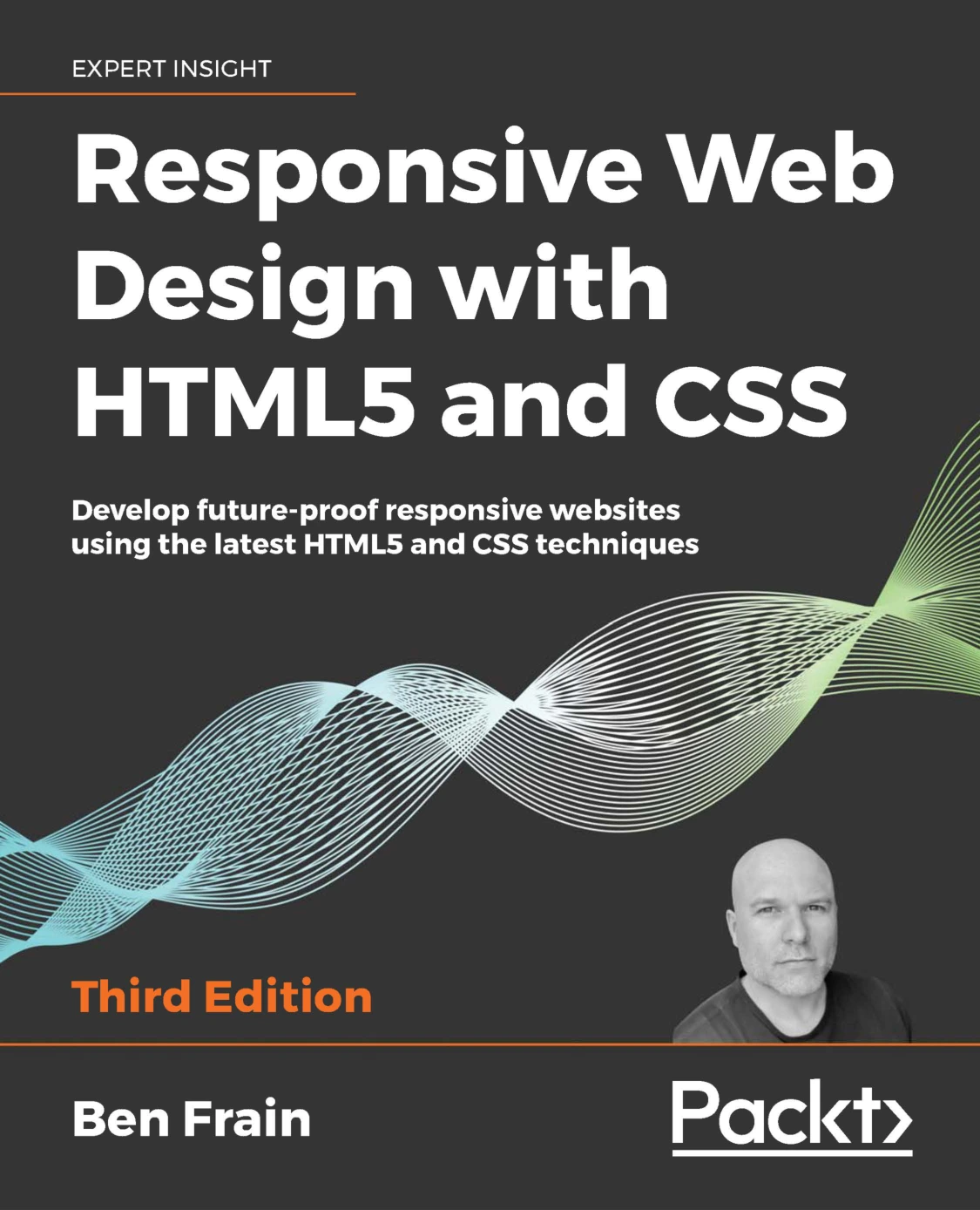
Responsive Web Design with HTML5 and CSS, Third Edition
Original price was: $5.00.$2.50Current price is: $2.50.

Ben Frain
Product Specs:
- File Type: PDF
- File Size: 10.2 MB
- Book Language: English
- Total Page Count: 409
- Instant Download
Build Interfaces That Adapt to the Device in Hand 💻
Responsive web design is less about chasing every new screen size and more about writing HTML and CSS that can handle change gracefully. Ben Frain’s third edition of Responsive Web Design with HTML5 and CSS approaches that challenge with a practical, code-first mindset. Published by Packt Publishing in 2020, the book is aimed at developers and designers who want a durable understanding of how modern responsive websites are assembled.
Across its pages, the third edition revisits the core ideas behind responsive layouts and updates them for contemporary HTML5 and CSS techniques. The result is a guide that treats responsiveness as a structural decision, not a cosmetic patch applied at the end of a project.
What the Third Edition Explores
Frain starts with the essentials: the browser and device landscape, the viewport meta tag, flexible images, and the media queries that let a layout change at different widths. From there, the book moves into the markup layer, examining HTML5’s semantic elements and how they can give a page clearer structure. Accessibility is part of that conversation, with coverage of WCAG conformance and WAI-ARIA for more inclusive web applications.
Later sections turn to CSS layout. The book looks at converting fixed pixel designs into fluid, proportional layouts, then introduces Flexbox as a tool for alignment, ordering, and responsive arrangement. Responsive images receive dedicated attention as well, since they are often where a visually polished design meets real-world performance constraints.
HTML5, CSS, and the Details That Matter
This is not a book that treats HTML5 as a list of new tags to memorise. It considers how elements such as main, section, nav, article, aside, header, and footer shape the meaning of a document. The text-level semantics, the role of headings, and the practical use of figures and captions all feed into the same goal: markup that communicates clearly to browsers, assistive technologies, and other developers.
Media handling also gets a practical treatment. The book covers embedding video and audio in HTML5, providing alternate media sources, and making video and iframes behave responsibly within a responsive layout. These are the kinds of details that separate a demo from a site that works across real devices.
Media Queries Beyond Width ⚙️
Media queries are central to responsive CSS, but the third edition does not stop at minimum and maximum widths. It explores conditional logic, query syntax, organising queries, and advanced considerations for maintaining them in a growing codebase. Media Queries Level 4 features such as pointer, hover, and prefers-color-scheme are also introduced, showing how a design can respond to input method and user preference, not just screen dimensions.
That broader view matters. A touch device, a mouse-driven desktop, and a user who prefers dark mode may all encounter the same website, but they do not interact with it in the same way. The book encourages developers to account for those differences without overcomplicating the CSS.
Who Will Get the Most From This Book
Readers with a foundation in HTML and CSS will find the most value here. The material is structured for web designers and front-end developers who want to build responsive sites with maintainable code, and for those who need a refresher on modern layout techniques. Beginners may benefit from pairing it with introductory CSS material, while experienced developers can use it to sharpen their approach to Flexbox, responsive images, and media-query strategy.
If you are looking for a single trick that solves every layout problem, this is not that book. If you want a method for writing responsive HTML5 and CSS that can survive new devices, changing requirements, and the next wave of browser features, Ben Frain’s third edition offers a clear and practical path.
User Reviews
Be the first to review “Responsive Web Design with HTML5 and CSS, Third Edition”
You must be logged in to post a review.
Original price was: $5.00.$2.50Current price is: $2.50.




There are no reviews yet.