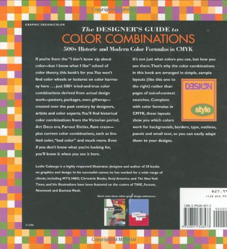
If you’re from the “I don’t know zip about color – but I know what I like” school of color theory, this book’s for you. You won’t find color wheels or lectures on color harmony here . . . just 500+ tried-and-true color combinations derived from actual design work – posters, packages, even giftware – created over the past century by designers, artists and color experts. You’ll find historical color combinations from the Victorian period, Art Deco era, Far-out Sixties, Rave craze – plus current color combinations, such as limited color, “bad color” and much more. Even if you don’t know what you’re looking for, you’ll know it when you see it here.
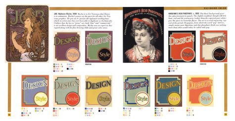
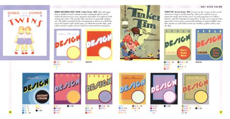
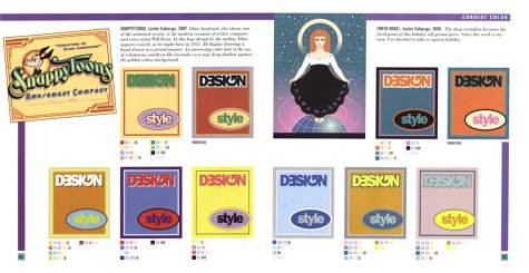
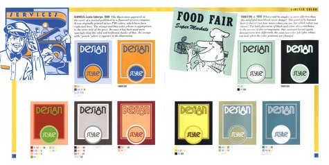
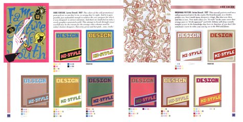
It’s not just what colors you use, but how you use them. That’s why the color combinations in this book are arranged in simple, sample layouts rather than pages of out-of-context swatches. Complete with color formulas in CMYK, these layouts show you which colors work for backgrounds, borders, type, outlines, panels and small text, so you can easily adapt them to your designs.
Read more
65 reviews for The Designer’s Guide to Color Combinations
3.8out of 5
★★★★★
★★★★★
7
★★★★★
3
★★★★★
1
★★★★★
1
★★★★★
1
Write a review
Show allMost HelpfulHighest RatingLowest Rating
★★★★★
kiss barnabas –
I’ve just received my order, and after two hours of browsing, reading, andtrying out some of the color combinations, I can truly recommend this bookfor anyone who’s interested in coloruse during history. This book is NOT about colortheory: it will not teach you how to use acolorwheel. But it will give fantastic value for money if you want to getan overview of coloruse during the century’s. The guide can be used aswell in a practical sense (for each of the examples there are CMYK values)but it also delivers in the plain just browse, marvel, gasp and getinspired department. Also interesting is the fact that for each of the examples, there arevariations included as well so you can see how different combinations canlead to a total different mood using the same colors in a differentlayout. If your looking for a book which forfills the needs above, look nofurther, this is it. I think the critics who give bad reviews, can only bejealous about the extreme work it must have costed the author to collect,examine and compile this book. FANTASTIC !!!
Helpful(0)Unhelpful(0)You have already voted this
★★★★★
Granny H –
I like this book, it has a good layout and some nice colour schemes, though felt that it could have been better if it offered more schemes per section. If (for example) you did a lot of ’50s retro, you’d be using the same colour scheme over and over… Still good to have on the shelf when stumped for colour pallets.
Helpful(0)Unhelpful(0)You have already voted this
★★★★★
M S –
This is a great book if your going int graphic design or artist specialist to keep up with the times.
Helpful(0)Unhelpful(0)You have already voted this
★★★★★
Kate Troy –
Interesting book shows colour combinations I wouldn’t have thought about putting together.
Helpful(0)Unhelpful(0)You have already voted this
★★★★★
David Goodman –
Got this book for my boyfriend who is a graphic designer. He loves it!
Helpful(0)Unhelpful(0)You have already voted this
★★★★★
jojoshee –
Personally, I found this book to be a poor example of colour combinations. The submitted photograph shows an example of one of the pages, which are all set up the same. I gave it a One Star rating only because I could not give a No Star.
Helpful(0)Unhelpful(0)You have already voted this
★★★★★
Kwill –
good quality, quick and reliable vendor, thank you very much, i am totally satisfied either with the product an the delivery
Helpful(0)Unhelpful(0)You have already voted this
★★★★★
jojoshee –
I’m the type of guy that learns better by example than explanation, which is why I really like this book. It gives not only really nice color palettes, but it also shows how to use them. The only reason I gave it four stars is because I wish it was a longer book.
Helpful(0)Unhelpful(0)You have already voted this
★★★★★
John S. –
Very good condition, thank you just like new in fact. Book incredible price and cheap delivery. Good colour combinations but I didn’t realise it was such an old book so doesn’t go beyond the year 2000! Designer has nice bits of insight to give and useful opinions. I needed it for ideas for colour combinations and it certainly gives me plenty to think about. Would have been good to have RBG colour values too but no matter. CMYK is good enough
Helpful(0)Unhelpful(0)You have already voted this
★★★★★
DLJOHNSON –
I greatly admire the work of Leslie Cabarga — particularly in the book LOGO FONT & LETTERING BIBLE. Perhaps because of the aforementioned authorship, I let my guard down in purchasing DESIGNER’S GUIDE TO COLOR COMBINATIONS. The same tired layout is depicted hundreds of times in colors sampled from “historic” paintings. Though subject to personal opinion, I find the large majority of such colors are period dated or otherwise unsuitable for current graphic design projects. As with other books of this sort, the Live Color feature in Adobe Illustrator CS3 renders this reference work unnecessary.
Helpful(0)Unhelpful(0)You have already voted this
★★★★★
BevKetter –
I expected more information and a group of swatches showing many colors that work together. For all the stars recommending this book I am disappointed! It did come on time.
Helpful(0)Unhelpful(0)You have already voted this
★★★★★
Billz –
Better than any other book on color combinations, Leslie Cabarga clarifies not only color harmony but color arrangement. I believe his approach to color harmony makes far more sense than color wheels and rainbow illustrations. By taking good examples throughout history, one can get not only a flavor of what works, but can see the color in context. Some combinations repeat themselves, but in different contexts they look different as well. By putting in the CMYK percentages, it is very easy to transfer the colors to a computer for immediate use. For those who are artistically challenged (such as this reviewer), there is a refreshing sense to Cabarga’s work. He shows very clearly why bad color combinations are such and why good ones that work do in fact work. Each example is provided in a sensible context rather than a stack of colors, and most valuable is Cabarga’s use of variations of the same color set to illustrate how radically different the same group of colors look in different arrangements. I also liked Cabarga’s comments about key illustrators and their subject matter–even including expressing doubts about Paul Whiteman being the King of Jazz. Cabarga seems to know his artists and doesn’t mind expressing any opinon that comes to mind whether on artists or the state of just about anything. Moreover, his opinions never get in the way of his discussion of color. (Even the opinions are colorful.) It’s good to know books are still written by human beings rather than grey committees.
Helpful(0)Unhelpful(0)You have already voted this
★★★★★
JuneP –
I just loved this book! It’s so useful for so many of my art projects, including my latest interest in soap making. The book has more useful and beautiful, color combinations than I could ever get around to using. It’s a great inspiration resource for anyone using color for personal or work use.


kiss barnabas –
I’ve just received my order, and after two hours of browsing, reading, andtrying out some of the color combinations, I can truly recommend this bookfor anyone who’s interested in coloruse during history.
This book is NOT about colortheory: it will not teach you how to use acolorwheel. But it will give fantastic value for money if you want to getan overview of coloruse during the century’s. The guide can be used aswell in a practical sense (for each of the examples there are CMYK values)but it also delivers in the plain just browse, marvel, gasp and getinspired department.
Also interesting is the fact that for each of the examples, there arevariations included as well so you can see how different combinations canlead to a total different mood using the same colors in a differentlayout.
If your looking for a book which forfills the needs above, look nofurther, this is it. I think the critics who give bad reviews, can only bejealous about the extreme work it must have costed the author to collect,examine and compile this book.
FANTASTIC !!!
Granny H –
I like this book, it has a good layout and some nice colour schemes, though felt that it could have been better if it offered more schemes per section. If (for example) you did a lot of ’50s retro, you’d be using the same colour scheme over and over… Still good to have on the shelf when stumped for colour pallets.
M S –
This is a great book if your going int graphic design or artist specialist to keep up with the times.
Kate Troy –
Interesting book shows colour combinations I wouldn’t have thought about putting together.
David Goodman –
Got this book for my boyfriend who is a graphic designer. He loves it!
jojoshee –
Personally, I found this book to be a poor example of colour combinations. The submitted photograph shows an example of one of the pages, which are all set up the same. I gave it a One Star rating only because I could not give a No Star.
Kwill –
good quality, quick and reliable vendor, thank you very much, i am totally satisfied either with the product an the delivery
jojoshee –
I’m the type of guy that learns better by example than explanation, which is why I really like this book. It gives not only really nice color palettes, but it also shows how to use them. The only reason I gave it four stars is because I wish it was a longer book.
John S. –
Very good condition, thank you just like new in fact. Book incredible price and cheap delivery. Good colour combinations but I didn’t realise it was such an old book so doesn’t go beyond the year 2000! Designer has nice bits of insight to give and useful opinions. I needed it for ideas for colour combinations and it certainly gives me plenty to think about. Would have been good to have RBG colour values too but no matter. CMYK is good enough
DLJOHNSON –
I greatly admire the work of Leslie Cabarga — particularly in the book LOGO FONT & LETTERING BIBLE. Perhaps because of the aforementioned authorship, I let my guard down in purchasing DESIGNER’S GUIDE TO COLOR COMBINATIONS. The same tired layout is depicted hundreds of times in colors sampled from “historic” paintings. Though subject to personal opinion, I find the large majority of such colors are period dated or otherwise unsuitable for current graphic design projects. As with other books of this sort, the Live Color feature in Adobe Illustrator CS3 renders this reference work unnecessary.
BevKetter –
I expected more information and a group of swatches showing many colors that work together. For all the stars recommending this book I am disappointed! It did come on time.
Billz –
Better than any other book on color combinations, Leslie Cabarga clarifies not only color harmony but color arrangement. I believe his approach to color harmony makes far more sense than color wheels and rainbow illustrations. By taking good examples throughout history, one can get not only a flavor of what works, but can see the color in context. Some combinations repeat themselves, but in different contexts they look different as well.
By putting in the CMYK percentages, it is very easy to transfer the colors to a computer for immediate use. For those who are artistically challenged (such as this reviewer), there is a refreshing sense to Cabarga’s work. He shows very clearly why bad color combinations are such and why good ones that work do in fact work. Each example is provided in a sensible context rather than a stack of colors, and most valuable is Cabarga’s use of variations of the same color set to illustrate how radically different the same group of colors look in different arrangements.
I also liked Cabarga’s comments about key illustrators and their subject matter–even including expressing doubts about Paul Whiteman being the King of Jazz. Cabarga seems to know his artists and doesn’t mind expressing any opinon that comes to mind whether on artists or the state of just about anything. Moreover, his opinions never get in the way of his discussion of color. (Even the opinions are colorful.) It’s good to know books are still written by human beings rather than grey committees.
JuneP –
I just loved this book! It’s so useful for so many of my art projects, including my latest interest in soap making. The book has more useful and beautiful, color combinations than I could ever get around to using. It’s a great inspiration resource for anyone using color for personal or work use.