“Story hook, tragic moment, poster, or outrageous character, the covers lured us in.” – Paul Levitz, president of DC Comics 2002-2009
From the trailblazing works of Bob Kane, to the photorealistic stylings of Adam Hughes and quirky humour of Amanda Conner, DC Comics Cover Art is a collection of the most iconic covers in DC’s history. Stunning artwork is accompanied by expert commentary exploring the significance of each cover, while artist profiles shed light on their creators.
Discover the most striking covers from more than 85 years of DC Comics.
204 reviews for DC Comics Cover Art: 350 of the Greatest Covers in DC’s History
4.7out of 5
★★★★★
★★★★★
8
★★★★★
2
★★★★★
1
★★★★★
0
★★★★★
0
Write a review
Show allMost HelpfulHighest RatingLowest Rating
★★★★★
R. Fentiman –
A few of these classics I remember from newsagents shelves back in the 1960s, but so many were completely new to me – and there are some beautiful artworks in here. I would have liked a few more notes on the artists techniques involved, but maybe that information is lost on the older ones – a minor niggle.
Helpful(0)Unhelpful(0)You have already voted this
★★★★★
W. C. Brooks –
Loved this book. A reminder that once upon a time DC Comics was fun.
Helpful(0)Unhelpful(0)You have already voted this
★★★★★
Pablo F. –
I got one book with covers from Marvel and I liked it so much. This one was something I asked for some time ago. This one is smaller and thinner, but the quality is acceptable. I cannot understand why “the dark knight returns” cover appears with such a tiny size… The editors has something against Frank Miller?
Helpful(0)Unhelpful(0)You have already voted this
★★★★★
Matthew T. Weflen –
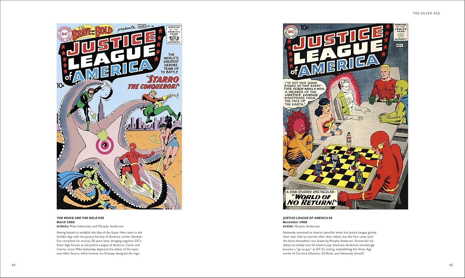
Any DC fan will enjoy this book. It is a compendium of great covers and the artists who made them. The book is organized into 5 sections: Golden Age, Silver Age, Bronze Age, “Steel Age,” and Modern Age. Each of these sections features a spotlight of some of the leading artists of the era (for instance, the Bronze Age features spotlights of Dick Giordano, George Perez, Jack Kirby, and Joe Kubert). Now, I think the nomenclature is a bit odd, since I’ve never really heard the 90s referred to as the Steel Age, but whatever. The whole thing remains chronological, and many truly great covers by the likes of Carmine Infantino, Neal Adams, (who strangely does not receive a spotlight bio), Brian Bolland, and many more.
Personally, I find the Modern Age section quite lackluster. I think this owes itself to a number of factors. It is the shortest of the bunch, and many, many “Variant” covers are featured. Variant covers are dumb cash grabs in my book, and they usually have nothing to do with the story contained in the book – generally they are just some sort of pinup image an artist created as a one off. So they all end up feeling very “samey” – Superman looking godlike, Batman looking grim, etc. etc. But this is a minor beef – the other “ages” are truly splendid and offer a real flavor for the kinds of stories and the styles of art that made those ages great.
There are many pages that feature three covers along the top third of the page with a paragraph of text apiece, with a lot of unused negative space below in the bottom third. I wish the covers had been laid out in a column of three with larger art and text to the side, with no negative space on the page. The full page splash covers are really gorgeous, and all the art is well represented with original coloring and good fine detail on glossy pages. I just wish more of the space had been filled with such glorious art.
All in all, for the price this is a very nice gift for a DC aficionado. It’s not perfect, but little is. It’s fun to flip through and gain inspiration for one’s own drawing or for one’s decisions in retro-comic reading.
Helpful(0)Unhelpful(0)You have already voted this
★★★★★
David C. –
Well researched. Well made. A great anthology book.
Helpful(0)Unhelpful(0)You have already voted this
★★★★★
Amazon Customer –
Grandson loved
Helpful(0)Unhelpful(0)You have already voted this
★★★★★
Gagewyn –
This is a totally worthwhile book. If the topic interests you, this will deliver.
I got it to look at with little kids. I like comic books, but I don’t like the universes so much binecause I don’t want to have to deal with all this back story. The collected covers is nice for me, because the cover usually has the best most dramatic art. The covers are selected sometimes for looking cool, but sometimes because the specific comic issue was significant or because the series was important so they picked a cover from it. It’s fine with me. Like I said, the cover is usually there to catch the eye and so the art is there.
Production quality is fine. I got the hardcover. The book is very slightly oversized at 9 1/3 by 11 1/2 inches. Paper is thick enough that there isn’t any bleed through and printing on the back of one page is totally hidden on the other side of the page. Printing is good quality, and for many of these older comic books, this reproduction is worlds better than an original comic book issue. Printing is good enough to do justice to the more modern covers when full color printing became the norm for comic books.
There was one small flaw in how this was printed. The black was printed separate from each color. On a few of the pages, the color was shifted very slightly (ie. black and color printing don’t line up exactly). It wasn’t throughout the book, but it was noticeable on the handful of pages it occurs on.
How it’s arranged: Each page will have either a single full page reproduction of a cover, or 2 to 4 smaller covers reproduced. Each cover has a caption giving the name, number, and date of the issue, the illustrator or illustrators who did the cover, the writer for that issue, and a few sentences about the character, issue, or cover. The info in captions was relevant and interesting. Covers are a little chronological, in that the front of the book tends to be the oldest covers and the end of the book tends to be the newest covers. Within the loose chronological arrangement, covers are grouped by character or theme. For example, there is a two page spread of Swamp Thing covers, and the captions on those tell you that there is another Swamp Thing cover elsewhere in the book and give the page number. It doesn’t have an index, but the table of contents is OK for finding specific characters.
My kids, ages 3, 5, and 7 seem to like this book. They can browse, and because of the way it’s organized, if they ask me to find a specific character, I can quickly find that character for them. There isn’t particularly anything inappropriate for children. The captions even refer to sex as “consumating” or just don’t reference it and are a little bit beat around the bush. The only thing that might be bad for young kids is that the covers can be scary, for example, with a hero in danger or a cover showing murder victims.
Overall, if this book seems interesting to you, it’s done well and the printing is good quality.
Helpful(0)Unhelpful(0)You have already voted this
★★★★★
Paul Spencer –
As someone who has been reading DC titles for over 40 years, it was great seeing so many covers from the different decades of following DC Titles.
The book quality is excellent and the same goes for the content. I’m sure there will be plenty of disagreement on what constitutes the best DC covers ever, but this is pretty close and most of my favourites featured.
Helpful(0)Unhelpful(0)You have already voted this
★★★★★
Vicki Heilman –
Wow what an amazing book. Bought it for a gift for a major collector and the quality of this was outstanding.. he loved it
Helpful(0)Unhelpful(0)You have already voted this
★★★★★
Mister Blue –
I wouldn’t exactly call this the greatest covers or the most interesting. I’ve seen much more interesting covers than the ones used in this book. It’s not to say that they’re bad or anything, but hardly the greatest. These covers were clearly chosen for a specific reason; a character was introduced (either the title character or a new foe), or a marriage was taking place (normally with a fake-out cover), a character was killed off or some kind of crossover event was happening.
It’s not difficult to see that the more popular character’s have the most covers throughout the book, with Batman easily having the lion’s share. This is followed by Superman, Green Lantern and Wonder Woman. Personally, I would have liked to have seen an equal divide with the covers – not just favourites.
Unfortunately, the artwork is hardly shown in the best light due to multiple sizes used. Some covers are page sized, some are half page, some are a quarter size, and then some are ridiculously small. This makes it difficult seeing any great detail in some of the covers. There’s a lot of wasted space throughout the pages with a bit of text that accompanies each photo. Personally, I think this was poor design planning on the part of DC. Surely they could have come up with something much better than this.
Except for a few talented artists during the Steel Age (1986-2010), but mostly during the Modern Age (2011 – Present) it’s not difficult to see that the majority of the cover art looks as though it was done by group of ten year old children, especially in comparison to older covers. It’s an embarrassment to see just how much the artwork has de-evolved.
Overall, this book is still alright for anyone who’s interested in DC covers art.
Helpful(0)Unhelpful(0)You have already voted this
★★★★★
Joe Baron –
This book is crammed full of DC art work from over the decades categorizing them in the relevant comic book ages (gold, silver, bronze, steel etc). There is some real good ones in there and it also does a good job of summarising changes at DC over the years. Well worth the tenner if you like comic cover art.


R. Fentiman –
A few of these classics I remember from newsagents shelves back in the 1960s, but so many were completely new to me – and there are some beautiful artworks in here.
I would have liked a few more notes on the artists techniques involved, but maybe that information is lost on the older ones – a minor niggle.
W. C. Brooks –
Loved this book. A reminder that once upon a time DC Comics was fun.
Pablo F. –
I got one book with covers from Marvel and I liked it so much. This one was something I asked for some time ago. This one is smaller and thinner, but the quality is acceptable. I cannot understand why “the dark knight returns” cover appears with such a tiny size… The editors has something against Frank Miller?
Matthew T. Weflen –
Any DC fan will enjoy this book. It is a compendium of great covers and the artists who made them. The book is organized into 5 sections: Golden Age, Silver Age, Bronze Age, “Steel Age,” and Modern Age. Each of these sections features a spotlight of some of the leading artists of the era (for instance, the Bronze Age features spotlights of Dick Giordano, George Perez, Jack Kirby, and Joe Kubert). Now, I think the nomenclature is a bit odd, since I’ve never really heard the 90s referred to as the Steel Age, but whatever. The whole thing remains chronological, and many truly great covers by the likes of Carmine Infantino, Neal Adams, (who strangely does not receive a spotlight bio), Brian Bolland, and many more.
Personally, I find the Modern Age section quite lackluster. I think this owes itself to a number of factors. It is the shortest of the bunch, and many, many “Variant” covers are featured. Variant covers are dumb cash grabs in my book, and they usually have nothing to do with the story contained in the book – generally they are just some sort of pinup image an artist created as a one off. So they all end up feeling very “samey” – Superman looking godlike, Batman looking grim, etc. etc. But this is a minor beef – the other “ages” are truly splendid and offer a real flavor for the kinds of stories and the styles of art that made those ages great.
There are many pages that feature three covers along the top third of the page with a paragraph of text apiece, with a lot of unused negative space below in the bottom third. I wish the covers had been laid out in a column of three with larger art and text to the side, with no negative space on the page. The full page splash covers are really gorgeous, and all the art is well represented with original coloring and good fine detail on glossy pages. I just wish more of the space had been filled with such glorious art.
All in all, for the price this is a very nice gift for a DC aficionado. It’s not perfect, but little is. It’s fun to flip through and gain inspiration for one’s own drawing or for one’s decisions in retro-comic reading.
David C. –
Well researched. Well made. A great anthology book.
Amazon Customer –
Grandson loved
Gagewyn –
This is a totally worthwhile book. If the topic interests you, this will deliver.
I got it to look at with little kids. I like comic books, but I don’t like the universes so much binecause I don’t want to have to deal with all this back story. The collected covers is nice for me, because the cover usually has the best most dramatic art. The covers are selected sometimes for looking cool, but sometimes because the specific comic issue was significant or because the series was important so they picked a cover from it. It’s fine with me. Like I said, the cover is usually there to catch the eye and so the art is there.
Production quality is fine. I got the hardcover. The book is very slightly oversized at 9 1/3 by 11 1/2 inches. Paper is thick enough that there isn’t any bleed through and printing on the back of one page is totally hidden on the other side of the page. Printing is good quality, and for many of these older comic books, this reproduction is worlds better than an original comic book issue. Printing is good enough to do justice to the more modern covers when full color printing became the norm for comic books.
There was one small flaw in how this was printed. The black was printed separate from each color. On a few of the pages, the color was shifted very slightly (ie. black and color printing don’t line up exactly). It wasn’t throughout the book, but it was noticeable on the handful of pages it occurs on.
How it’s arranged: Each page will have either a single full page reproduction of a cover, or 2 to 4 smaller covers reproduced. Each cover has a caption giving the name, number, and date of the issue, the illustrator or illustrators who did the cover, the writer for that issue, and a few sentences about the character, issue, or cover. The info in captions was relevant and interesting. Covers are a little chronological, in that the front of the book tends to be the oldest covers and the end of the book tends to be the newest covers. Within the loose chronological arrangement, covers are grouped by character or theme. For example, there is a two page spread of Swamp Thing covers, and the captions on those tell you that there is another Swamp Thing cover elsewhere in the book and give the page number. It doesn’t have an index, but the table of contents is OK for finding specific characters.
My kids, ages 3, 5, and 7 seem to like this book. They can browse, and because of the way it’s organized, if they ask me to find a specific character, I can quickly find that character for them. There isn’t particularly anything inappropriate for children. The captions even refer to sex as “consumating” or just don’t reference it and are a little bit beat around the bush. The only thing that might be bad for young kids is that the covers can be scary, for example, with a hero in danger or a cover showing murder victims.
Overall, if this book seems interesting to you, it’s done well and the printing is good quality.
Paul Spencer –
As someone who has been reading DC titles for over 40 years, it was great seeing so many covers from the different decades of following DC Titles.
The book quality is excellent and the same goes for the content. I’m sure there will be plenty of disagreement on what constitutes the best DC covers ever, but this is pretty close and most of my favourites featured.
Vicki Heilman –
Wow what an amazing book. Bought it for a gift for a major collector and the quality of this was outstanding.. he loved it
Mister Blue –
I wouldn’t exactly call this the greatest covers or the most interesting. I’ve seen much more interesting covers than the ones used in this book. It’s not to say that they’re bad or anything, but hardly the greatest. These covers were clearly chosen for a specific reason; a character was introduced (either the title character or a new foe), or a marriage was taking place (normally with a fake-out cover), a character was killed off or some kind of crossover event was happening.
It’s not difficult to see that the more popular character’s have the most covers throughout the book, with Batman easily having the lion’s share. This is followed by Superman, Green Lantern and Wonder Woman. Personally, I would have liked to have seen an equal divide with the covers – not just favourites.
Unfortunately, the artwork is hardly shown in the best light due to multiple sizes used. Some covers are page sized, some are half page, some are a quarter size, and then some are ridiculously small. This makes it difficult seeing any great detail in some of the covers. There’s a lot of wasted space throughout the pages with a bit of text that accompanies each photo. Personally, I think this was poor design planning on the part of DC. Surely they could have come up with something much better than this.
Except for a few talented artists during the Steel Age (1986-2010), but mostly during the Modern Age (2011 – Present) it’s not difficult to see that the majority of the cover art looks as though it was done by group of ten year old children, especially in comparison to older covers. It’s an embarrassment to see just how much the artwork has de-evolved.
Overall, this book is still alright for anyone who’s interested in DC covers art.
Joe Baron –
This book is crammed full of DC art work from over the decades categorizing them in the relevant comic book ages (gold, silver, bronze, steel etc). There is some real good ones in there and it also does a good job of summarising changes at DC over the years. Well worth the tenner if you like comic cover art.